The graphic style is present in any visual support, any website and even in a food packaging! But what is it concretely?
We are going to answer this question and also present you some graphic styles that we particularly like at Snoweb!

Anne-Laure Compain
We can define a graphic style as the graphic framework of a creation. It is the direction in which a graphic design professional, be it a graphic designer, an art director, a web designer or a motion designer, will go.
The graphic style allows to define the appearance of shapes and lines, colors, shadows, roundings or letters.
Let's just go back to an important point. What is the purpose of a website :
As for everything, a website must follow the trends to properly meet the needs of its target. While remaining of course consistent with its sector of activity.
In this article, we review some graphic styles and their strengths in the web.
Flat design is a very minimalist design. It is also called "flat" design because there is no notion of volume or 3D in flat design. The elements are drawn with simple shapes and solid colors without gradients (in the industry, it is also called flat colors).
The primary goal of flat design is to create simple, uncluttered shapes without details. In web design, flat design is very interesting because it allows to focus on the essential without adding unnecessary details.
On the image below you will see the difference between a realistic visual (left) and a flat design visual (right).
Flat design is very popular for making icons because, thanks to its minimalism, flat design will represent only the essential. And, for an icon it is the most important since its use is often of small size. The content must be extremely readable.
Here is an example of using flat design on a website.
Let's add volume to our creations with isometrics! As you can see on our site, at Snoweb we love isometrics!
We can see isometry as the addition of flat design and 3D. Isometry allows you to distinguish the sides and the top of an illustration. From the viewer's perspective, it's like looking at a garden from the second floor of a building.
For some types of computer graphics, isometrics is more recommended. It allows you to visualize things better than if they were done in flat design.
But be careful, creating a visual in isometry requires a certain logic. Isometry is based on a 120° rule. And yes, we are going to do geometry!
Personally, I advise you to work from a grid to be sure that your visual will be isometric. And that all your elements are aligned. As on the example below, the perfectly isometric cube allowed me to create my isometric cue grid.
To help you visualize the isometry, here are some examples of illustrations with on the left the visual in flat design and on the right in isometry.
Just like flat design, isometry in websites allows to simply convey a message or to simply illustrate a text that could be more difficult to understand alone. This type of illustration will attract the eye while letting the text live around it. The illustrations will not monopolize all the attention of the reader, as it can be done with 3D.
When to use isometrics for a website ?
In this example, you will see the beauty of mixing animation and isometry. When both are mastered, the rendering is really very attractive.
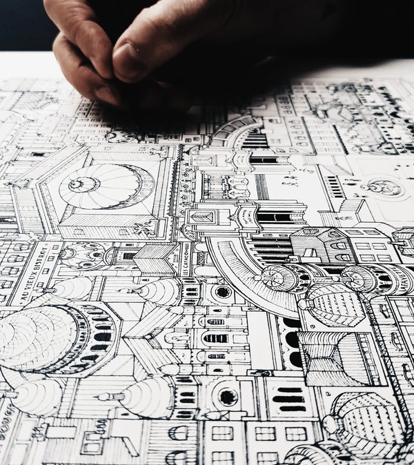
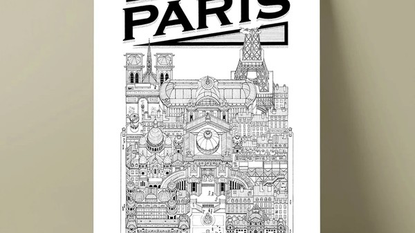
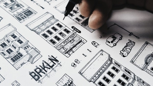
As its name suggests, line art consists in creating visuals with lines. It can be used for :
Here is an example of Docteur Paper, an artist from Nantes who makes illustrations of cities online and it is simply successful.
Here is a comparison between an illustration made in flat design, on the left and a logo made in line art, on the right.
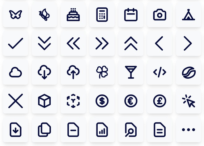
Another way to use line art is by creating icons for the web. As in the example below:
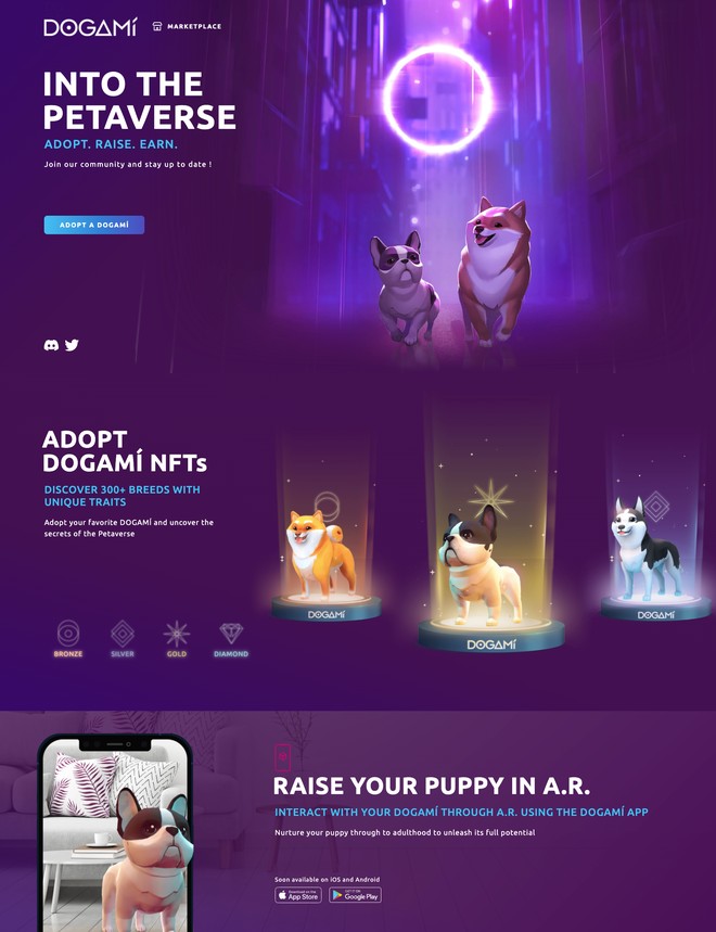
3D, as its name indicates, allows you to visualize objects in 3 dimensions. This graphic style is less used in the web because the rendering of images is often very heavy and therefore has a negative impact on the performance of the website. Nevertheless, here is an example of a website using 3D. And, you'll see, their little dogs are to crunch!
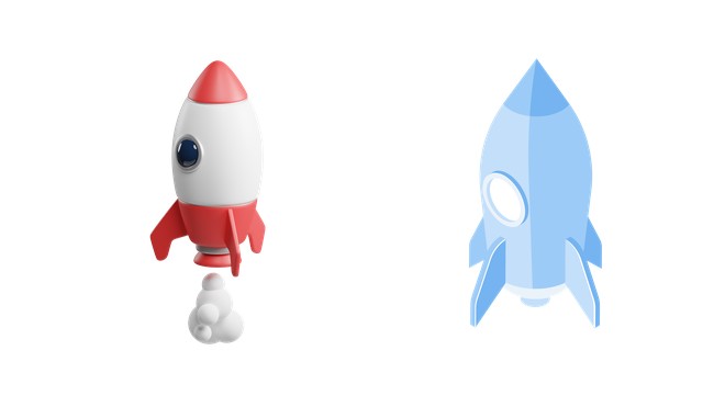
In the image below you can see a 3D element on the left and an isometric element on the right. On the 3D element, there is more volume, texture and the light is not reflected in the same way.
Using 3D in a website is very common nowadays. It allows to present more realism for a product or a concept. But not only! It also allows to present a story that would be difficult to explain with words or simple illustrations.
When to use 3D for a website?
In these 4 fields, there is a common point: a will to show a high level of know-how. In the luxury industry, one might want to show a watch from several angles. In the automotive industry, a well-made 3D view is a perfect substitute for a film made in the open air. And finally, to present new technologies, 3D can help to show technical expertise, schematics or even a whole mechanism hidden inside the product.
Straight out of video games, pixel art is a very difficult art to master. Indeed, to make shapes stand out, and especially rounded shapes with the help of small squares of color is quite complex.
It should be noted that pixel art was the first way to draw from a computer. At the time, to create an image, you had to draw it square by square with simple colors.
On this example, the cherries are represented in pixel art on the left and in flat design on the right. The visual difference is obvious.
As you will see, pixel art is not really appropriate for websites. The texts are not very readable, difficult to understand and the design is rudimentary.
The cartoon style is a style that is close to flat design. But we add contours, bright colors and simple shapes. We arrive then at the cartoon style, a style that reminds of cartoons, playful and fun.
In this example, we can see the difference between :
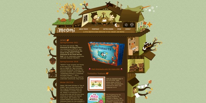
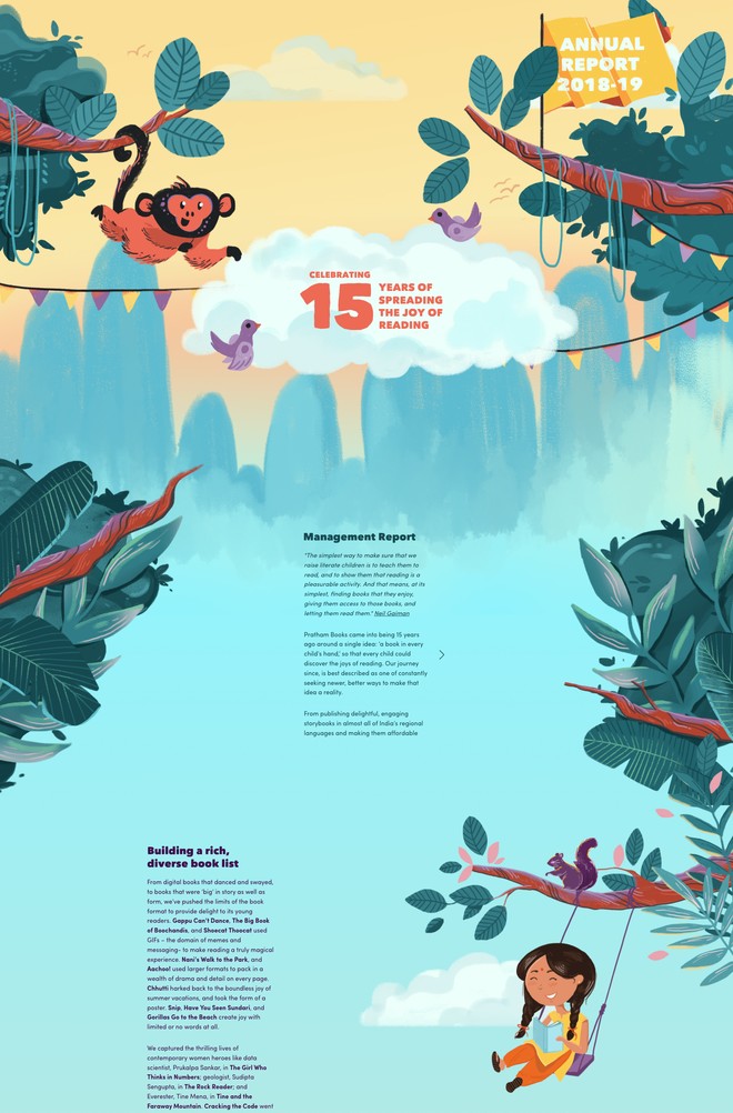
More and more popular, illustrations are becoming more and more important in communication media. The illustrative style allows to convey a soothing, relaxing, homemade and sincere message. It is easier to immerse a person in an idea if the setting and characters are part of it.
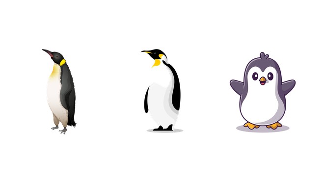
The "imperfect" side of an illustration will give a handmade feel and bring a little human touch. In the example below, here are 3 different illustration styles!
In the web, the illustrative style will allow to announce news not or little comforting in a lighter way. It is often used in the following areas:
But also in :
As you have seen in this article, there are many graphic styles to illustrate a brand and a website. The choice of the graphic style will depend primarily on the target and what it wants to see.
It should be noted that once the graphic style is established, it will be part of the graphic charter of the brand and will be used in all communication.
The subject of web design fascinates you, so these articles should interest you too.

Anne-Laure Compain

Alexis Le Baron

Anne-Laure Compain

Anne-Laure Compain

Anne-Laure Compain

Anne-Laure Compain


