WEB DESIGN

How to make a website model?

Wanting to create a website is a thing more and more anchored in the minds. In fact, a website allows to present to potential customers the services, actions or achievements made by a person or a company.

But before launching into the development of a website, it is necessary to think about its architecture and its appearance. We speak then about model of web site.

Anne-Laure CompainAnne-Laure Compain

Anne-Laure Compain

Graphic designer at Snoweb
Published on 28 March 2022 (Updated on 12 April 2022)


Web mockups must be created by a professional graphic and web designer, in other words, a web designer. Venturing into the creation of model by yourself can be long and quite perilous. Moreover, to create a captivating and intuitive website for the Internet user, it is necessary to know some notions of ergonomics.


1. What is a web site mockup?

A website mockup is the result of several steps of creation to provide a graphic representation of the layout of a website. In fine, the web model will represent what the future website will look like with :

  • Its colors
  • Its blocks
  • Its menu
  • Its buttons
  • Its logo
  • Its illustrations or images
The model is simply the step before the development of the website.

For some people, who know what they want on their website, this step of creating a model will seem unnecessary. But they are wrong! Mock-ups allow you to structure your ideas, to establish an intelligent site architecture and finally to test the layout. It is not once on the CMS or with the developer that we must test to move or change blocks and elements just to "see what it gives". That's what mockups are for.

As mentioned above, it may seem smart to eliminate this mock-up creation step to save both production time and money. But believe me, it's not. You have to know how to lose time to save time. When we make the specifications of a website, it must include this part "model" with at least the wireframes! It is also necessary to think of allocating time for that, because the conception of models can take several weeks, according to the site to be made.

πŸ’‘ If you would like more information about the content of a specification, we have detailed it in a blog post.

The advantages of creating a web model

Prevention

To prevent possible errors and correct them before launching the development.

Test

To test several design or layout ideas.

Reflection

To work on the ergonomics and to think about the user path.

Anticipation

To save time on website development.

2. The steps to create a website model

2.1 Starting from a blank page, obsolete or important?

Personally, I'm a paper and pencil lover, strange for a web designer? Well, no! I always start a creation, a model or an illustration with sketches.

Regarding the creation of a model, on paper, we can already make the wireframe or zoning. This allows you to sort out and put your ideas in place at a lower cost.

But be careful, this paper step just allows to make some sketches! To make a professional model, it is important to move quickly enough on a design software. And if you wonder why, it's simply for the sharing of the document and for its evolution. On paper you are quickly restricted whereas on a software you can create many pages and different lengths. It's also important to have a clear and readable mock-up to share with a developer or a client so that they understand what you've done.

2.2 The tree structure

tree structure website

The tree structure of a website has an importance on the fluidity of navigation, but also on the SEO, or natural referencing. Everyone knows the usefulness of a table of contents in a book. Well, we can compare the tree structure of a website to a table of contents. In other words, the tree structure is the hierarchy of the pages of a website.

To make a fluid tree structure, we will put ourselves in the place of the final user who will walk on the website. We will then think about which path he will take to get to the action: contact, purchase, registration, etc..

The main objective of a tree structure is to make sure that the Internet user reaches his goal quickly. It is therefore necessary that the pages are well connected and that the site menu is clear.

2.3 Wireframe and graphic model, what are the differences between the two?

The wireframe and the graphic model are two very distinct steps. It can be seen as follows:

  • Step 1: wireframe
  • Step 2: graphic model

The wireframe or functional model

Also called zoning, the wireframe will schematize the structure of a website. The idea is to place geometric shapes to represent blocks, texts and images. All this to show the main areas of content and interaction of the site. It is at this point that you have to think about ergonomics and design the site as simply as possible so that the user can find the information quickly and easily.

By the way, this is another point that makes you need to go through a professional to make your mock-ups.
wireframe example

The prototype or graphic model

Contrary to the wireframe, the graphic model will be more advanced and more precise. Here, each part of the site will be detailed, each functionality will be designated and the graphic elements of the website will be included. On the graphic model, we also find the text content, the colors, the logo and the right typography.

It is at this moment that we realize if the ideas we had in mind are feasible on the web and, if they are not, we must rethink them.

To help you create the graphic model, it is interesting to make an inspiration board with the different styles of website or illustration that we like.

The graphic elements of a web model

The graphic charter

The graphic charter is a founding element of a brand and groups together all the graphic concepts of the brand. Namely, the logo, the colors and the typography.

The graphic charter

The logo

It is important to have a logo in the right format on a website. It must be visible no matter the size of the screen. That's why you need a horizontal logo!

The format of the logo

The colors

The colors must be in accordance with the graphic charter of the brand so that the site is consistent with the logo and other communication media.

Colors in the web

Typography

More commonly known as fonts, the typography will help the readability and understanding of the text. They will also give character to the site.

Choose your typography

The action buttons

Essential element of a web page, the action buttons or call to action. They allow the user to make a decisive action: contact, registration, purchase ...

The action buttons

Illustrations and images

Choosing the right style of illustrations is important for the brand image. And I advise you to choose the SVG format which is light and allows beautiful animations.

SVGs in the web

3. How to design a website mock-up?

Study the competition

Look at what your competitors are doing and get inspired by their website and their communication strategy.

Be careful, I said "inspire you"! It is not a question of copying and pasting your competitor's website. You will not get any satisfaction from it and you will not have any credibility with your customers.

Listing

List the elements you want to appear on the website and the pages that will constitute it.

Page content

Next, move on to the content of the page you are creating. Follow traditional layouts and use a grid to keep your elements aligned and within the main layout of the site.

You see it on all sites, this is the area where the elements of a page will be displayed. For example, on websites, you can see that text and images do not go from one edge to another. There is a blank area on the sides.

Here are some tips for designing a model

  • If you add an element to your page, think about its purpose.
    • Will it add relevance to the content?
    • Will it interest or help the user?
  • Organize the elements of a page in a logical way.
    • Think of a web page as a newspaper cover. Elements are placed by importance and by degree of relevance to the reader.
  • The colors on the layout must be thoughtful
    • They must be consistent with the logo and the identity of the brand so that the user assimilates a color to the brand. He will identify it more easily afterwards.
  • Do not waste time creating pretty shapes and writing your texts.
    • Use substitute text and square, rectangular and round shapes to represent your images, text areas or buttons.

4. Mistakes not to make when creating a website model

  • Use too many colors

    A website must certainly be dynamic, attractive, design, modern, etc. But it must above all convey a message! And too many colors will disturb the eye of the Internet user. The site will therefore appear overloaded and, in the end, no information will be retained by the user.
  • Keeping fake texts on the graphic model

    Having fake texts on the first tests is interesting. But, after a while, it is essential to put real text in order to better understand the final result and the amount of text to be written.
  • Forgetting to work with a grid

    The grid in a model allows to "arrange" the elements, to align them to each other and to work in a defined area. This grid allows you to have a model consistent with the final rendering of the website.
  • Forget to highlight the buttons

    Buttons are very important in a website. They are the only elements that allow the user to take action. Buttons will attract the eye, bring a sense of urgency and help conversion.
  • Do not follow the user path

    The user path is the path that the user will follow on a website to find what he is looking for. This path must be simple, short and without pitfalls.

5. Tools to create website models

Google Slides

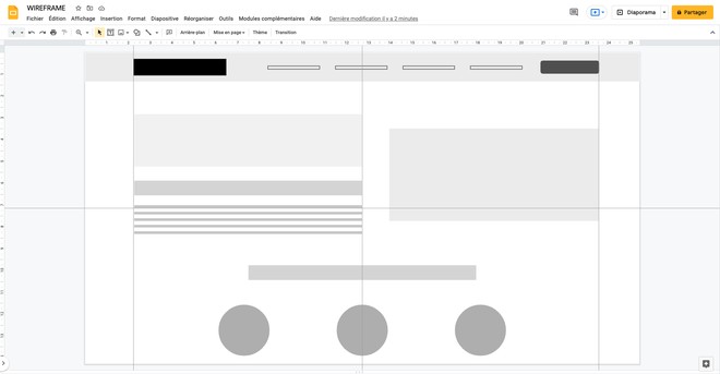
The first tool I'm going to talk about is a tool that can be used by people without graphic skills. Google Slides is similar to Power Point and is available for free on Google. From Google Slides, you can create the zoning of your website with geometrical shapes quite easily.

πŸ‘πŸΌ Free and easy to learn software

πŸ‘ŽπŸΌ Not recommended for websites requiring many pages and features

Google Slide screenshot


Adobe XD

Part of the Adobe suite, Adobe XD is a very powerful tool to make web page layout. Designed for that, XD offers to create links between buttons and/or pages and thus create a dynamic prototype.

πŸ‘πŸΌ Complete software with many plug-ins to help with design

πŸ‘ŽπŸΌ Paid software and quite complicated to get started. It takes several hours of work on it before mastering the software

Adobe XD screenshot


Sketch

πŸ‘πŸΌ Complete software with many plug-ins to help with design

πŸ‘ŽπŸΌ Paid software and reserved for professionals because difficult to use

Sketch screenshot


Mockflow

πŸ‘πŸΌ Very easy to use software that offers multitude of wireframe ranges depending on the type of site you are doing.

πŸ‘ŽπŸΌ Free features are quite limited

Mockflow screenshot


Wireframe.cc

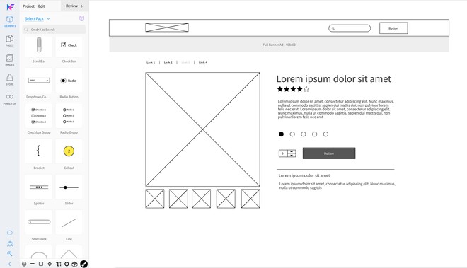
πŸ‘πŸΌ The interface is simple, maybe even too simple. It allows you to see the rendering on other media like phone and tablet.

πŸ‘ŽπŸΌ Freemium software, which has 7 days free.

Wireframe screenshot


Moqups

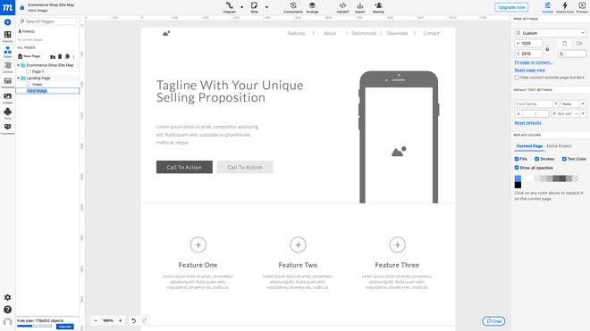
πŸ‘πŸΌ Tool that allows you to work in teams on the same project.

πŸ‘ŽπŸΌ Free features are quite limited

Moqups screenshot


FAQ about website mock-ups

To bring your design to life, you can use a web development agency such as Snoweb, a freelance developer or even use a CMS and reproduce your design using the CMS blocks.

You can contact me and I will guide you for the design of your models. Then, thanks to our development department, your models will come to life on the web.

ALL OF THEM! Mockups are essential to organize the layout and structure of a website. Whether it is for a landing page, an e-commerce, a showcase site, a blog or a portfolio.

I want to create mywebsite models