A real trend, the dark mode seduces the majority of websites, platforms and software today. With many notable advantages, this configuration stands out on different points. We will detail why dark mode is coming out of the shadows. 🌗

Anne-Laure Compain
More and more appreciated by Internet users, the dark mode has become popular lately. Offering a more discreet display, this configuration has become popular on most applications, social networks, and even operating systems.
Concretely, the dark mode is a theme that offers an interface consisting mainly of black and gray. Used by digital giants such as Facebook, Snapchat, Linkedin, Twitter, Tik Tok, Netflix and Apple, this configuration has many advantages.
However, be careful to differentiate the dark mode from the night mode. Indeed, the night mode reduces the intensity of blue light on our screens. While the dark mode will change the colors of the website or application.
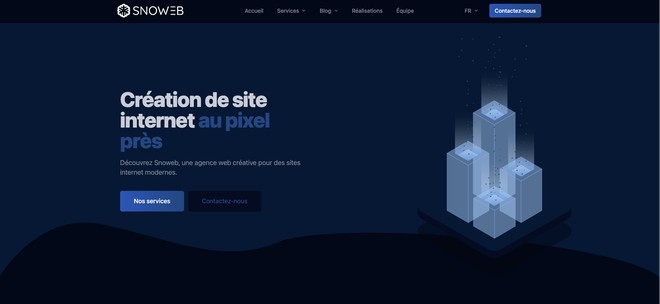
Below, find a preview of the Snoweb website in dark mode. By the way, maybe some of you are currently reading this article in dark mode!
The first strength of the dark mode is its ability to correctly adapt to the user. This alternative to light mode allows users to switch display themes according to their desires. In other words, it offers the possibility to switch from the classic white background version which is not always appreciated to a darker version in one click.
In addition, the dark shade manages to unify the pages and colors of a device. This system allows to :
After several hours behind a screen, we have all experienced this eye fatigue. The white background of the light mode tires the eyes because of its high intensity in white light. In the middle of the night, this observation is even more alarming. Your screen can even act as a lamp because the white light is so strong!
This is due to the diffusion of emitted waves containing a large amount of blue-violet light.
Moreover, according to a research of the University of Toledo in the United States, the constant exposure to these waves can lead to the ocular degeneration and the alteration of the retina...
Thus, changing the theme to dark mode can then avoid these problems and give your eyes a rest. By eliminating a large part of blue light, which prevents the production of melatonin (the sleep hormone), the dark mode allows to fight correctly against sleep disorders.
With the dark mode, texts and elements of a page become more readable. Moreover, as there is no white on the page, the eye is less tired and can therefore read longer.
But be careful, all this depends on the colors of the website. Indeed, if the dark background is black and the text is white, the reading will not be comfortable at all. It will look as if the text is moving or becoming blurred. A little further down in this article, I explain how to manage your colors in dark mode!
Moreover, with the dark mode, the visually impaired as well as the color blind have a better visibility of the information. In other words, the reading of a content becomes more accessible, and to a greater number.
Warning: point of vigilance for the choice of the nuances of colors. Badly controlled shades can generate an undesirable effect. This is why it is essential to use classic codes of black, gray and blue
We are talking about using dark mode on a smartphone, tablet or laptop. At its Android Dev Summit conference in 2018, Google confirmed that dark mode would save battery power. According to the study, this reduction in consumption can be as much as 60% of the total electrical energy used per day.
In other words, the less battery power you use on your device, the less you need to recharge it! Which is good for our Planet.
The dark mode can quickly become very attractive and eye-catching. Indeed, on a black or dark background, it becomes easier to highlight some colored contents, by contrast effect. A good use of simple, basic and discreet colors allows to bring a visual satisfaction to the Internet users.
In addition, black is the color most often used in the luxury and prestige fields. One could think that a black background will bring luxury and prestige to his website. But it is not so simple! Black is not enough to bring luxury, secondary colors and typography play an important role.
However, the dark mode also has disadvantages, such as the transmission of certain emotions or the feeling of oppression.
In terms of emotions transmitted with colors, we have classics :
But beware associated with certain colors their meaning changes completely:
All this to tell you that it is important to choose the right colors to get the right message. You can have the intention to pass a positive message but it will be felt as a negative message. The dark mode is not beneficial for all websites.
For more information on the meaning of colors, I let you read this article on design and color: a duo of shock.
Have you ever been in a room with dark walls ? If so, you know what I'm getting at! The space quickly becomes small, you feel that the walls are getting closer to you. The same goes for a website. If your website is too dark, people won't feel comfortable browsing it. That's why you shouldn't make all the elements of your website dark !
It is possible to use the dark mode on a web page, a website and on most of the available interfaces. To do this, two distinct systems can be adopted. The first choice is based on the integration of an automation system for the website in question. The second one gives the opportunity to the user to switch from one mode to another by installing an adapted switcher on the platform.
This solution is very practical for a company that wants to reach the heart of Internet users. The concept is simple and is based on the user's preferences. In other words, if a visitor uses a dark mode on his browser or on his device, the website he is visiting will also have this configuration. Just like it happens with the clear mode, except that we don't realize it! Our device (computer, tablet or smartphone) is configured in clear mode so everything is displayed in clear mode.
Of course, the expertise of a good web developer is required to make this adjustment automatically. Indeed, this kind of manipulation requires work and adapted skills.
Example: by choosing the dark mode in the settings of your smartphone, some websites can automatically appear in dark mode (if the web developer manages it). You can experience this with the Finnish Lapland travel site !
By opting for the dark mode in the settings of your smartphone, browser or computer, some websites can automatically appear in dark mode.
This system remains the most used concept at the moment. To do this, it is not mandatory to really know the preferences of the visitors. Whether it is for the dark mode or for the classic version, the best is to let the Internet users make their own choice. In this perspective, it is enough to install a scroll button or a slider to switch the theme to dark mode, and vice versa.
It is also possible to use both methods for its website. In this way, we follow the preferences of visitors, while leaving them the freedom to change the configuration at any time. The use of an adapted switch, a slider button or a setting tab is therefore necessary for this change. This can be seen on this example made by Zhenya Karapetyan.
Social networks, browsers, websites, and even television interfaces, dark mode is everywhere in our daily lives. It can allow you to differentiate yourself from your competitors, but by respecting certain principles.
Black is a dull color, it is better to choose a black color tinted with blue, purple or green or dark gray for website backgrounds. Moreover, black increases the contrast between two colors and the eye does not like it.
It is important to know that the dark color appeals :
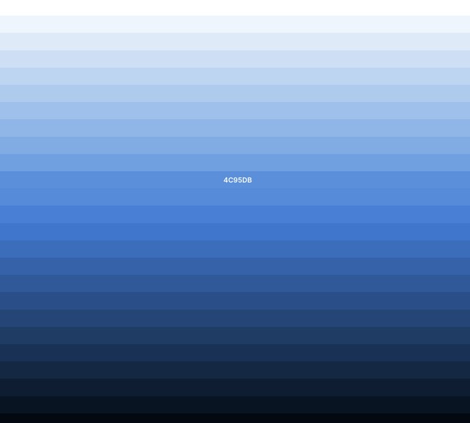
Does your brand identity already contain dark shades? Perfect! Now you just need to work on dark color palettes based on these shades. But how do you do that?
First, you should know that background colors in dark mode are often :
These are classics that work every time. After that, nothing prevents you from using a brown or a dark green, but be careful, these are more complicated color palettes to build.
Here is an example of 4 dark color palettes :
Nevertheless, if your brand identity does not contain a dark color and you absolutely want to have a dark mode on your website, I advise you this:
Use the Coolors website to do this, it's a very useful tool for color management! Like on the example below.
According to the W3C, "The contrast ratio between a color and its background varies from 1 to 21 depending on the intensity of the emitted light." The contrast ratio allows us to know the difference between two colors. This ratio is written in the form A: A. It should be known that the more difference there is between the two numbers and the intensity of light between the two colors is great.
Here is what is recommended in terms of contrast :
| TYPE OF TEXT | COLOR CONTRAST RATIO |
|---|---|
Large text and graphics | 3: 1 on substance |
Small text | 4,5 : 1 in the background |
So we avoid putting a black background with white text on it. It will be impossible to read. Go for a light gray instead!
What does an over-saturated color do next to a dark color? It "vibrates"! It gives the impression that the outlines of the shape or the text move, so it is not pleasant to read. That's why, you have to use desaturated colors but also colors that adapt with the dark.
For example you will have to adapt your colors between light and dark mode, as on the example, look at ⬇️
The dark mode is a great evolution in the web and probably the new step for many support, whether it is websites or social networks.
This novelty allows users to spend more time on screens than before, so it is necessary to bring more and more relevant content to satisfy them.
Find all our articles on webapps

Anne-Laure Compain

Anne-Laure Compain

Anne-Laure Compain

Anne-Laure Compain

Alexis Le Baron

Alexis Le Baron


